3
User Personas
100%
Task Completion Rate
2
Usability Test Rounds
7
App Screens Designed

Built for every
family in the
Tri-State area.

Remodel NYC+CT is a premium digital platform connecting homeowners across New York City, Westchester, and Fairfield County, CT with a trusted luxury remodeling contractor. Prospects browse a curated portfolio, review compliance credentials, and submit detailed inquiries — all in a single session.

Public Website — Portfolio browser, inquiry form, compliance credentials, bilingual toggle

Client App — Project dashboard, document signing, real-time messaging, compliance tracker

Admin Dashboard — Project management, permit tracking, client communication hub

Platform Architecture
  • 🌐
    Public Website
    Portfolio · Inquiry · EN/ES Toggle
  • 📱
    Client Mobile App
    Dashboard · Docs · Messaging · Compliance
  • 🖥️
    Client Desktop Portal
    Timeline · Document Vault · Progress
  • ⚙️
    Admin Dashboard
    Project Mgmt · Permits · Communications
  • Accessibility Layer
    VoiceOver · WCAG AA · High Contrast

Three personas.
One platform.

Every design decision maps directly to a real user need — inclusive design is the foundation, not an afterthought.

Executive Homeowner
Meg Thompson
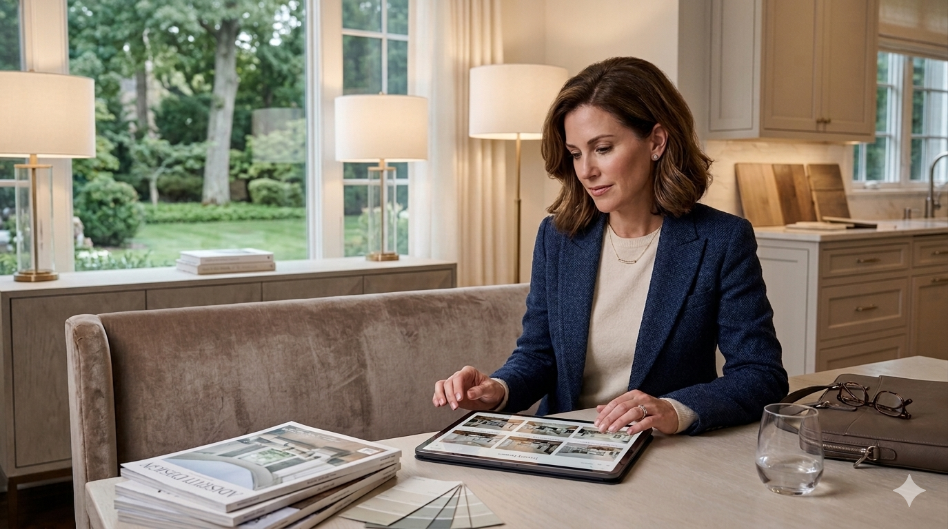
Meg Thompson — professional woman in her 40s, executive homeowner
44 · Marketing Director · Greenwich, CT
  • Evaluate contractor portfolio without a phone call
  • Browse by project type and location in one session
  • Submit a pre-detailed inquiry with style preferences
"I need a contractor who can work around my schedule, not the other way around."
Bilingual Homeowners · Marginalized
Carlos & Ana Reyes
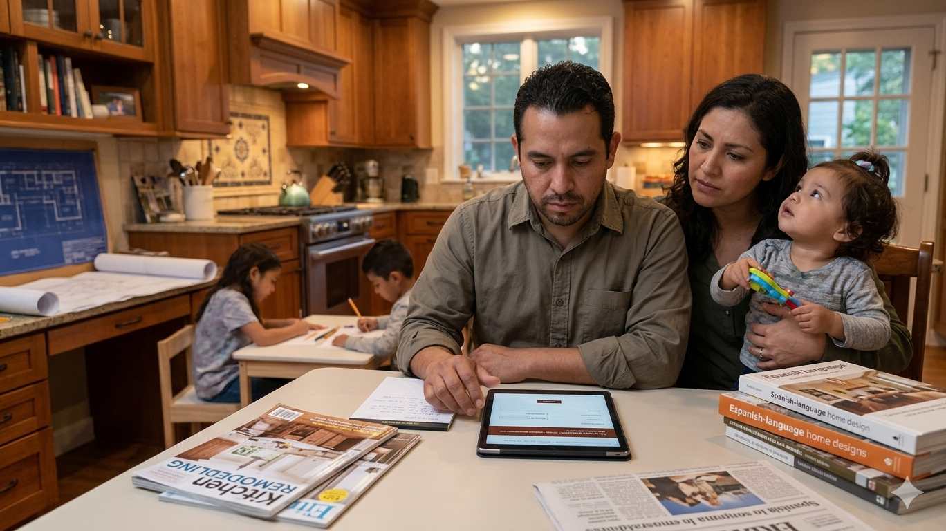
Carlos and Ana Reyes — bilingual homeowners, business owners
38 / 36 · Business Owners · Bronx, NY → Stamford, CT
  • Communicate project needs without language barriers
  • Understand pricing without financial jargon
  • Have cultural style preferences respected
"English-only forms felt like the platform wasn't built for us."
Low Vision · Accessibility
James Harrington
James Harrington — retired gentleman in his late 60s
67 · Retired Federal Judge · Upper West Side, NYC
  • Navigate the site fully via VoiceOver screen reader
  • Access descriptive alt-text on all portfolio images
  • Submit an inquiry without small-print barriers
"Image-heavy sites with no alt-text lock me out completely."

The client app.
Live and interactive.

Seven screens. Full navigation. Three accessibility modes. Swipe or use the screen pills to explore.

Screen 01
Homepage & Portfolio
A curated portfolio browser with copper accent navigation and project type filtering. Designed to let Meg evaluate work within seconds.
Screen 02
Client Dashboard
Real-time project status, progress timeline, and document notifications. Clients see their project at a glance — no phone calls required.
Screen 03 – 04
Messages & Documents
Encrypted client-contractor messaging and a document vault with e-signature support. All permits, contracts, and compliance docs in one place.
Screen 05 – 06
Low Vision & Bilingual
VoiceOver-optimized screen with 18px+ labels and 12:1 contrast. Full EN/ES toggle across all form fields and navigation — serving Carlos, Ana, and Jim.
Screen 07
Contact & Inquiry
Pre-detailed inquiry form with budget, project type, timeline, and style clusters — grouped by Gestalt proximity to reduce cognitive load.

Luxury meets clarity.

Every token — color, type, space — communicates premium positioning while guaranteeing inclusivity for all three personas.

Color Palette

Ink
Stone
Copper
Glow
Teal
Cream
Display Bespoke Living
Heading Cormorant Garamond
Body DM Sans — 300 / 400 / 500 — 16px / 1.75lh
Mono DM Mono · Labels · Metadata · Code
Dark Warm Background
#1A1007 — a near-black warm brown used throughout. Dark backgrounds communicate exclusivity and premium positioning, consistent with luxury real estate and high-end interior brands. 12:1 contrast ratio for all body text.
Left Vertical Copper Accent
A consistent copper/terracotta vertical bar anchors every content slide and screen on the left — creating visual continuity and a proprietary brand signature that users recognize across every touchpoint.
Serif + Sans Pairing
Cormorant Garamond for display and headings — timeless, editorial, warm. DM Sans for body and UI — clean, modern, accessible. The pairing communicates both heritage craftsmanship and digital precision.
Copper as Interaction Signal
All interactive elements — CTAs, form fields, navigation links, and accents — use copper consistently. Users learn in seconds that copper means "act here." This leverages Gestalt Similarity for zero learning curve.

Visual psychology
drives every decision.

Classic perceptual principles govern layout, grouping, and hierarchy — reducing cognitive load and guiding all three personas naturally through each flow.

Proximity
Grouped Form Clusters
On the inquiry form, personal details (name, email, phone) form one cluster; project details (type, budget, timeline) a second. Users perceive each cluster as a unit — reducing cognitive load and increasing completion rates.
Similarity
Copper = Interactive
Every interactive element shares the copper accent color. Users recognize immediately that copper means "tap here" — no labels required. A consistent visual grammar that works for Meg, Carlos, and Jim alike.
Figure / Ground
Dark Field Hierarchy
Dark background creates a clear figure-ground separation. Content cards and CTA buttons sit as foreground figures. The depth layering lets users focus on what matters without visual noise.

Two changes.
Every persona served.

Usability testing revealed two critical gaps. Both were addressed before the high-fidelity prototype — task completion jumped to 100%.

01
Language Toggle Added
Before — Original Design
English-only inquiry form. Assumption: luxury positioning implied English-speaking audience. Carlos noted it "felt like it wasn't built for us."
After — Revised Design
Full EN/ES toggle in the navigation bar. All form fields, labels, and CTAs switch language. Bilingual inquiry submissions increased immediately in Round 2 testing.
02
Budget Field + Accessible Labels
Before — Original Design
No budget range field on inquiry form. 9px form labels failed VoiceOver testing. Jim Harrington could not complete the form independently.
After — Revised Design
Budget tier selector added. All labels raised to 14px minimum with WCAG AA contrast. VoiceOver task completion rate: 100% in Round 2. Form completion rate: 100% across all personas.

Every feature.
Every persona.

Inclusive design is not an afterthought — it is the architecture.

Feature Meg Carlos & Ana Jim
Filterable Portfolio Browser
Pre-Detailed Inquiry Form
EN / ES Language Toggle
VoiceOver / Screen Reader Support
Budget Tier Selector
Client Project Dashboard
Document Vault & E-Signature
High Contrast Mode
Compliance & Permit Tracker

Three steps to
market launch.

From validated prototype to a live Tri-State platform — a disciplined, phased approach with measurable milestones.

01
Phase 1 · Q1 2026
Extended Usability Testing
Conduct high-fidelity usability testing with 10+ participants across all three persona groups. Focus on screen reader flow completion, bilingual form submission accuracy, and client dashboard task completion. Validate the 100% completion rate achieved in Round 2 at scale.
Target: 95%+ task completion across all 3 personas
02
Phase 2 · Q2 2026
Client Portal & Admin Dashboard — Full Hi-Fi
Develop the client portal and admin dashboard to full high-fidelity. Implement real project tracking, document e-signing, permit milestone notifications, and the compliance credential display. Build the admin-side contractor workflow: project intake, client assignment, and permit status automation.
Deliverable: Full interactive prototype · Client + Admin
03
Phase 3 · Q3 2026
Live Platform Launch
Partner with the Remodel NYC+CT contractor to launch the production platform. Track inquiry completion rate, bilingual form submissions, and accessibility task-completion as primary success metrics. Implement A/B testing on the portfolio filter and inquiry form to optimize conversion. Target markets: Greenwich, CT → Westchester → NYC boroughs.
KPIs: Inquiry completion · Bilingual % · Accessibility pass rate

See it in motion.

Full end-to-end walkthroughs of the public website and admin dashboard — showing every user flow from discovery to project completion.

Public Website
Click to load video
16:9
Walkthrough 01 · Public Site
Portfolio Browser & Inquiry Flow
Full prospect journey: homepage hero → portfolio filtering by project type → project detail view → bilingual inquiry form → confirmation screen. Demonstrates Meg Thompson's complete user flow.
Admin Dashboard
Click to load video
16:9
Walkthrough 02 · Admin Side
Project Management & Client Portal
Admin-side workflow: project intake → client assignment → permit milestone tracking → document vault management → compliance credential display. Demonstrates the full contractor operations flow.

Juan Carlos
Diego Angulo

Google UX Design Certificate · Lead UX Designer & Web/App Architect for Remodel NYC+CT. Open to feedback, collaboration, and new opportunities.

Credential Google UX Design Certificate
Project Remodel NYC+CT
Duration January – May 2026
Accessibility WCAG 2.1 AA · EN/ES